
Our new logo and how it got that way
An interview with designer extraordinaire Louie Mantia about our new wordmark

You may have noticed… that Hammacher Schlemmer has had a new logo for the last few months. Or perhaps you didn’t take conscious note, merely sensed on some level that the air around us felt fresher, somehow. As with cosmetic surgery, the trick with logo design is to make the right changes to keep looking like yourself.
There’s nobody we’d trust more with that delicate operation than Louie Mantia. He’s designed for Apple, Disney, Pixar, Nike, Target, and literally too many more household names to list here. With his design partner Luka Grafera, Louie runs Parakeet, a design studio that created many of the app icons you’ve used today.
Of course, we adore the logo Louie and Luka created. We think it captures both the deep history and the lighthearted sense of fun that sum up Hammacher Schlemmer. I talked to Louie about how they went about creating what we hope will be the definitive Hammacher logo for years to come.
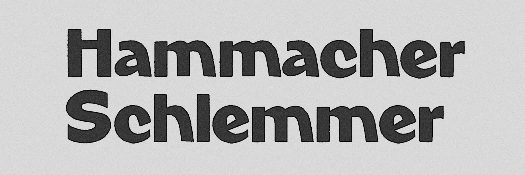
Gnomenclature: Hammacher Schlemmer has been around since 1848 and has a well-defined brand, but never maintained a specific visual identity for very long. So I’m curious how you went about tackling the assignment to do something that would sum up the visual history, when that visual history was kind of all over the place.
Louie: Yeah. So they’d been publishing catalogs for a really long time and some of those early ones were just, like, tools and stuff. It hit its stride like somewhere in the 1960s to the 1980s, you know? Before the ‘60s, there was not really, as you said, a strong visual identity. Whatever the typeface du jour was, that’s what they were using. But in the ‘60s to the ‘80s, on their catalogs, they had this logo that was interesting to me. It was kind of bold, it was a little scripty. For, I think, a lot of people, that ‘80s logo especially was when they loved it. So we started there.
G: And then you also incorporated a couple of other little touches. Talk about those details a little bit.
L: Yeah, so there were some little quirks, especially in the ‘60s logo. There was this funky A, which was kind of really cute.
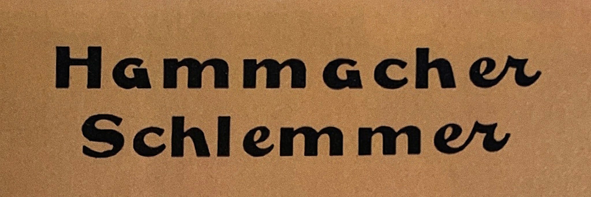
There was also this ER ligature (when two letters are connected, as in cursive writing - ed.) which made no sense for that ‘60s version. It was just this weird scripty thing. It didn’t look like everything else. Especially the R part of it was just like a very cursive R. When Luka and I were drawing this, we were just like, is there a nice way to make a ligature in the style of what they were going for in the ‘60s and ‘80s? There was an aesthetic there with the rest of the word mark. Can we do something that was like that?
We found that, of course, “Hammacher” and “Schlemmer” actually have a lot of the same letters. It’s not that many [different] letters total in the whole logo, you know? So we actually had really fun opportunities. There’s a CH in both of the words. There’s an ER in both of the words. So there was an opportunity to have a CH ligature, an EM ligature, an ER ligature, where they all just look natural when all written out like that.
One thing that we really wanted to keep was having that really high X height. Like all of those lowercase letters shouldn’t be that different from the capital letters because it is a long name. If you have a really short x height on there, you lose a lot of space in there, communicating this name.
So we thought with that, having the quirky A, and having the ligature in there, it felt like it was from both of those eras, the ‘60s and the ‘80s.
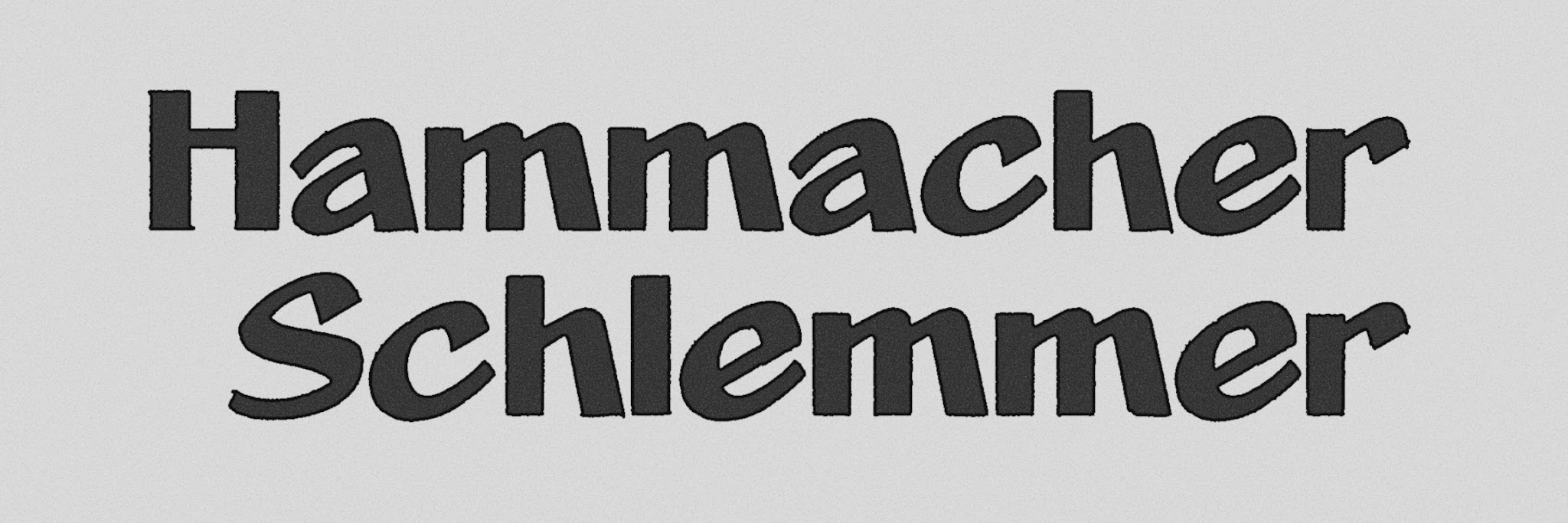
G: Tell me a little bit about that A. What did you think when you saw that?
L: Well, I think it’s really fun and quirky. I was just like, oh God, I don’t know, can we get away with doing that sort of thing? And we tried a few A’s when we sketched them out. There’s this classic like double-story A, you know, and we thought, well, maybe we should do that because that’s a little safer, that’s a little bit more readable.
But there’s something that kind of happens with a wordmark. There’s this bug in my brain, I think it’s Herb Lubalin, like he’s a famous type designer and graphic designer. And he said something like “sometimes you have to sacrifice legibility for impact.” I really think about that a lot, especially when it comes to this kind of logo type. These are long words, half of everyone is gonna probably pronounce them wrong anyway. Actually how readable does this need to be? How legible does this need to be? Is it okay? Like, how far can you push this letter, like, can we use an A that looks like that? Is it too weird? When I looked at it the first time, I’m like, I can read it. I know what it says. So maybe it’s okay if that’s the one little quirky part of it.
G: Yeah, if you plucked that A out of there, and just you were looking at it alone, you might not know that it was an A, but it works perfectly.
Right. Is that a capital G? It could be other letters in other contexts, I think.
G: Were there any other directions that you explored and ultimately decided not to go with?
L: When we looked at that ‘60s to ‘80s kind of area, there’s a few paths you can take from it. You can make it a little bit more slanty, right? Like there’s something about like the H in the ‘60s look that’s interesting, like it has a diagonal leg. The M doesn’t, which is weird. So we made it so that it did, but then we’re like, should some of the others letters be slanty too? Should the C and the E, should those like skew a little bit? Is that fun?
We had like five, I think, general directions, but they weren’t terribly different. When you look at all of these sorts of things, you can see where they all came from. You can see the center point of where they all could be. So they’re all just like, how much do we want to go in this direction? How much do we want to go in this direction? They’re not that far off.
G: So then we arrive at the new logo. Not to get too abstract, but I’d like just to hear about what you think the values or the feeling that it embodies are.
L: Yeah, so that ‘60s-’80s thing we keep talking about here, Luka and I knew that that was really important to retain that. But I think there’s something timeless about this. It is a modern interpretation of those older logos, it’s not too far away. Anyone that knew those logos or knew those catalogs from that time will look at this and it will feel familiar to them in a way that the previous Hammacher logo didn’t.
I feel like this is kind of going back to closer to what people have in their mind. Maybe even this is almost the platonic ideal of what it was, or what it should be. And I really think that it feels like it belongs on a catalog, you know what I mean? It feels like that’s where it should be.
G: Thank you for going into this. As soon as I saw the logo, I was like, yeah, this is it, it just fits. That’s what it’s supposed to be.
L: Very few brands have 180 years or whatever of history. This is a unique thing that I think is really cool. We don’t often get to make logos for companies that old. I mean, not many companies even exist that are that old, you know? It’s a rare opportunity.

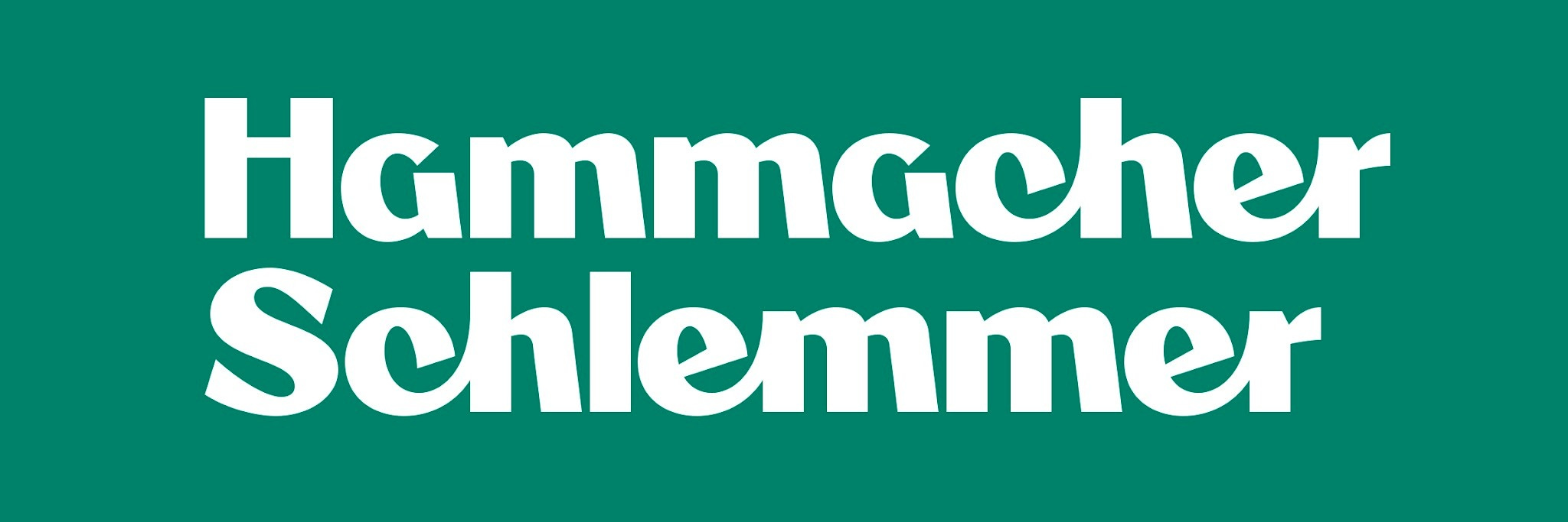
Ah, and there’s our spiffy new logo in situ, in its single-line variant. See it firsthand and celebrate another design classic in our Commodore 64 Ultimate event.
What’s up with the letter “a”? It looks like a “g”. It throws off the feng shui